
Ah, the internet: An endless well of knowledge right at your fingertips that doubles as a place to watch funny videos, connect with friends, shop for almost everything, and share your thoughts with the world.
Amid these digital wonders, the internet also hosts some hilarious and cringeworthy mishaps. Countless stories have soared viral, from ingenious ideas to cheeky Twitter accounts, questionable URLs, and fun Easter eggs.
But if you’re interested in finding some of the best, we’ve compiled them here. Maybe you’ll rediscover fond memories or uncover stories you may have missed.
1. Would You Like Fries With Your Horse Burger?
If you’re one of the millions of Americans who enjoy a good burger, you’ve likely explored different meats, from chicken and turkey to more exotic options like kangaroo, alligator, or rabbit. But you might reconsider trying one when the burger is something entirely unexpected.
In 2013, Tesco, a multinational retailer, was caught selling 29% horse meat burgers. The factory supplying Tesco with burgers used “multiple ingredients from some 40 suppliers in production batches, and the mixture could vary every half-hour.”
But that’s not the kicker. After the news, a Tesco employee tweeted: “It’s sleepy time so we’re off to hit the hay! See you at 8am for more #TescoTweets.”

When someone replied, “‘Hit the hay’ I SEE WHAT YOU DID THERE TESCO, I SEE IT,” Tesco quickly responded: “I’m terribly sorry. That tweet was scheduled before we knew of the current situation. We’d never intend to make light of it.”
Whoops!
2. It’s About To Get Way Too Personal
In the early 2000s, Craigslist was the go-to destination on the internet for anything you could imagine:
- Buying and selling stuff
- Job hunting
- Finding local services
- Even trying to find that special someone
And, with the internet being the internet, it’s no surprise the Craigslist personal ads section eventually became a little…unhinged. Although the personal ads section was removed in 2018, many old ads are still circulating.
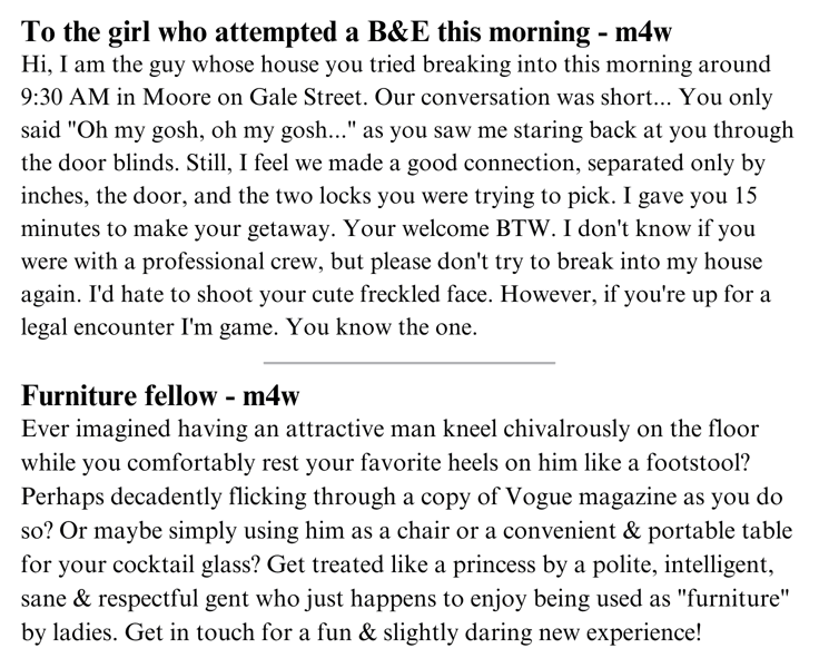
Take, for example, the guy from Oklahoma City on a quest to find the freckled woman who broke into his apartment because he thinks they had a “good connection.” Or how about the man searching for a woman to be his “furniture fellow” — someone to prop up her feet or hold her cocktail glass?
The online world truly never disappoints.
3. This Website Nails What Not to Do for UX
I apologize in advance for introducing you to the monstrosity website that is Arngren.
This online tech marketplace specializes in selling cars, scooters, and gadgets but lays out each product in a tightly designed grid of ads with overlapping text and images.

And don’t even think about browsing on mobile: Everything shrinks to fit on the tiny screen, making it impossible to read or interact in any way whatsoever.
The Angren website is a prime example of a ‘How To Create a Bad User Experience’ (UX) class.
4. When Starbucks Dev Sean K. Got Roasted
Anybody who works in software development knows how essential test stacks are. They’re designed to ensure that software applications perform correctly and are free from bugs or issues before they are released to users.
Unfortunately, the keyword “before” didn’t quite come to mind for one software dev. In March 2023, Starbucks developer Sean K. accidentally tested while in production, resulting in a mass app notification to iOS users that read, “Hello test1 from seank.”

Within minutes, ‘Starbucks Sean’ was trending on Twitter. While some responses were humorous and empathetic, others were downright roasts:
“If you’re having a tough day, just a reminder that at least you’re not Sean K from @Starbucks.”
“RIP seank. Best of luck my friend. We’ve all been there. #starbucks #SoftwareEngineer”
“Looks like someone is testing on the @Starbucks app in prod 👀👀”
“Hello seank, I think you mixed up your test and production keys.”
A Starbucks spokesperson quickly reassured users there was nothing to worry about: “Earlier today, some customers received a test notification from the Starbucks app in error. This was not caused by a data breach.”
In hindsight, it’s a funny error many can look back and laugh at. At least this mistake was nothing like when Hawaiian officials accidentally sent a missile threat alert to the entire state. It took nearly 40 minutes to send a second alert to confirm it was a false alarm.
Plus, Starbucks app users can rest easy knowing their notification system is as reliable as their caffeine and baked goods addictions.
5. RC Cola Could Learn A Thing From This Guy
One of the best things about Twitter is the social media masterminds behind well-known brands. Denny’s, Wendy’s, and Netflix are some fan-favorites, but Dr. Pepper Snapple’s RC Cola brand was at the forefront of Twitter comedy for a short period.
Well, RC Cola’s fake account was. This parody account quickly gained a following for hilarious tweets before Dr. Pepper Snapple worked with Twitter to suspend the fraudulent account. It took off with a famous SpongeBob meme.
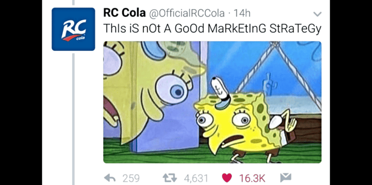
Unfortunately, Dr. Pepper Snapple wasn’t as pleased with the fake RC Cola account as its followers were. Its team quickly tweeted, “At this time we are working to actively pursue the deactivation of the fake account known as @OfficialRCCola with help from @Twitter.”
Although @OfficialRCCola only had a digital life of about one business day, it was yet another example of how humor, cleverness, and clapbacks win the Twitterverse.
6. No, Oldmanshaven.com Is Not a Picture of a Shaven Old Man
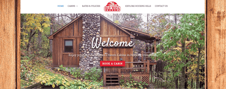
Although the URL looks as if it reads “old man shaven,” the website isn’t about a shaven old man. Instead, it’s an information and vacation rental booking website for the Old Man’s Haven Cabins in Hocking Hills, Ohio. It’s advertised as the perfect romantic getaway or family vacation destination.
If you own an eCommerce store or have ever built a website, then you know how important your domain name is. It serves as the initial impression you make on everyone about your business.
In fact, one of GoDaddy’s product experts emphasizes you should always bounce URL ideas off other people first, just in case they notice something you might’ve missed (like “haven” vs. “shaven”).
7. The Million Dollar Homepage Is Never Gonna Give You Up
The Million Dollar Homepage is a cleverly impressive representation of how simple the internet was in its early years.
College student Alex Tew started the website in 2005 to raise money for his university tuition. The homepage comprised one million pixels; each pixel block was sold for $1 as ad space.
The Million Dollar Homepage took off — every pixel was purchased, and Alex eventually could pay for his tuition. It also inspired other web owners to sell pixels for quick cash. Some businesses even bought entire inch-wide blocks to ensure their visibility.
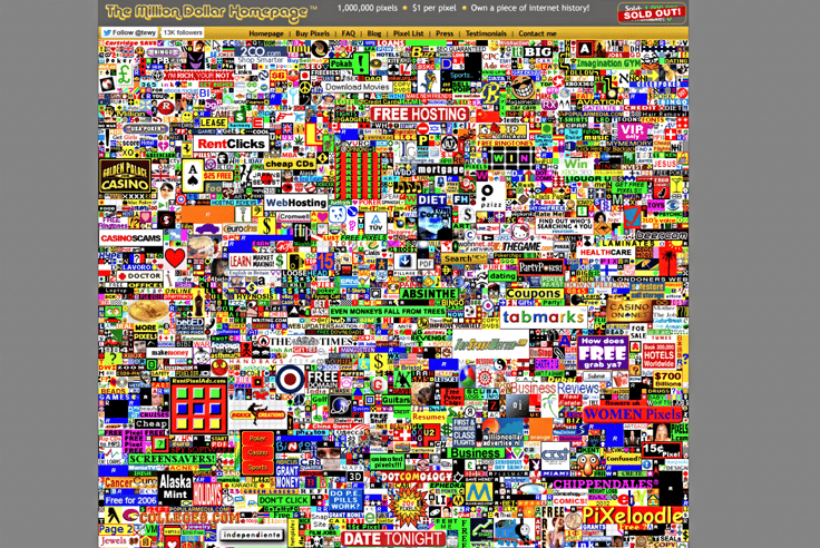
Today, if you visit the website, you’ll still find it alive and kicking, adorned with thousands of logos and ads, all crammed together in those iconic neon colors that were all the rage in the early days of the web.
Almost all the ads lead to an actual business website, but there’s at least one on there that doesn’t. You might want to prepare to get Rick Roll’d, depending on your pick.
8. A Cat-astrophic IT Disruption
For anyone who remembers the cat who sprinted across Yankee Stadium, here’s another feline tale: A cat belonging to one of the Kansas City VA Medical Center employees jumped onto their keyboard, unwittingly erasing a server cluster.
This mishap led to a four-hour server outage.

Kurt DelBene, assistant secretary for information and technology and CIO at the VA, addressed the event at a US Department of Veterans Affairs IT meeting.
The event harmed nobody, bringing a chuckle to those involved. Kurt cleverly added, “This is why I have a dog.”
Cat owners know this behavior isn’t anything new — but maybe it’s time to lay down some ground rules if you’re working in something as sensitive as IT.
9. Yale’s School of Art Website Is a Self-Deprecating Masterpiece
Everybody knows online presence and accurate branding is essential. Take the Sistine Chapel, a timeless masterpiece from the 15th century.
Its website reflects the chapel’s majesty, offering visitors an online tour and beckoning them to experience Rome’s grandeur in person.
You may think prestigious universities, like Yale, would copy the same line of thinking. But the Yale School of Art department decided to go in another direction — an ironic yet self-aware direction.

Its website intentionally embraces an unconventional aesthetic with clashing colors, quirky font choices, and a nostalgic 1990s-style background adorned with neon text.
This bold approach aligns perfectly with the incoming college-age students, especially the Gen Zers who are culturally fluent in today’s internet humor.
Yale seems to have hit the bullseye with this deliberately “poorly” designed website. It’s a move that many find to be a stroke of marketing genius.
10. The Poolife.com Port-a-potty-manteau
What do the words “brunch,” “smog,” and “motel” have in common? They’re all portmanteaus, a linguistic phenomenon where two words blend to create a new meaning.
Unfortunately, Poolife.com isn’t as fun as other famous brand portmanteaus, such as Netflix (internet + movie flicks) or Microsoft (microcomputer + software). At first glance, it just looks like “poo life.”
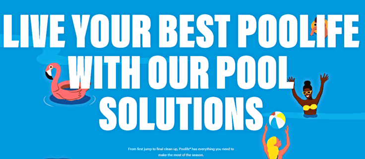
But before we judge too harshly, the owners of Poolife may have more marketing savvy than what meets the eye. Their grabby URL may be a testament to their cleverness — after all, it’s not a name you could easily forget.
11. This Software Company Is Probably Just Tired of the Internet
Your company’s website is essential: It represents who you are, what you do, and why people should buy from or work with you. It’s essentially an opportunity to say, “Hey, I can solve your problem, and here’s how.”
Well, that’s what your website should do most of the time. But not for Interrupt Technology Corporation.
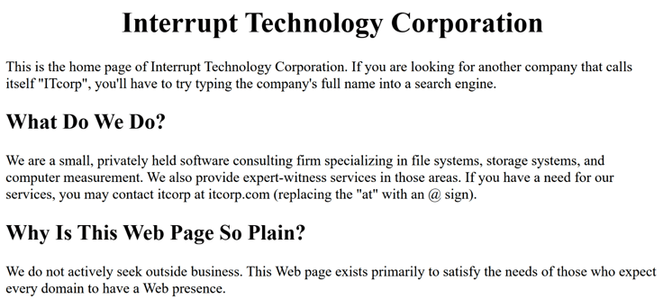
There are only a few lines of text on this webpage with no other visual elements. It addresses the most-asked question the company probably receives: “Why is this webpage so plain?”
“We do not actively seek outside business. This Web page exists primarily to satisfy the needs of those who expect every domain to have a Web presence.”
This software company’s plain-text webpage, featuring Times New Roman on a white background, is reminiscent of the simple style of web pages from the early days of the internet. The irony of a software company having such a basic site is an interesting move in today’s digital age.
Or maybe IT Corp finally said, “That’s enough internet for today,” and never looked back.
The Wonders of the Web
In a world where the internet serves as a playground of clever webpages, where viral tweets live on, and questionable personal ads thrive, one thing is clear — it’s a place where every click could lead to the unexpected.
But if there’s one takeaway from this journey, it should be this: Keep your sense of humor intact, your web presence creative, and your domain names double-checked. Who knows what the internet will serve up next?
Until then, happy surfing.


